
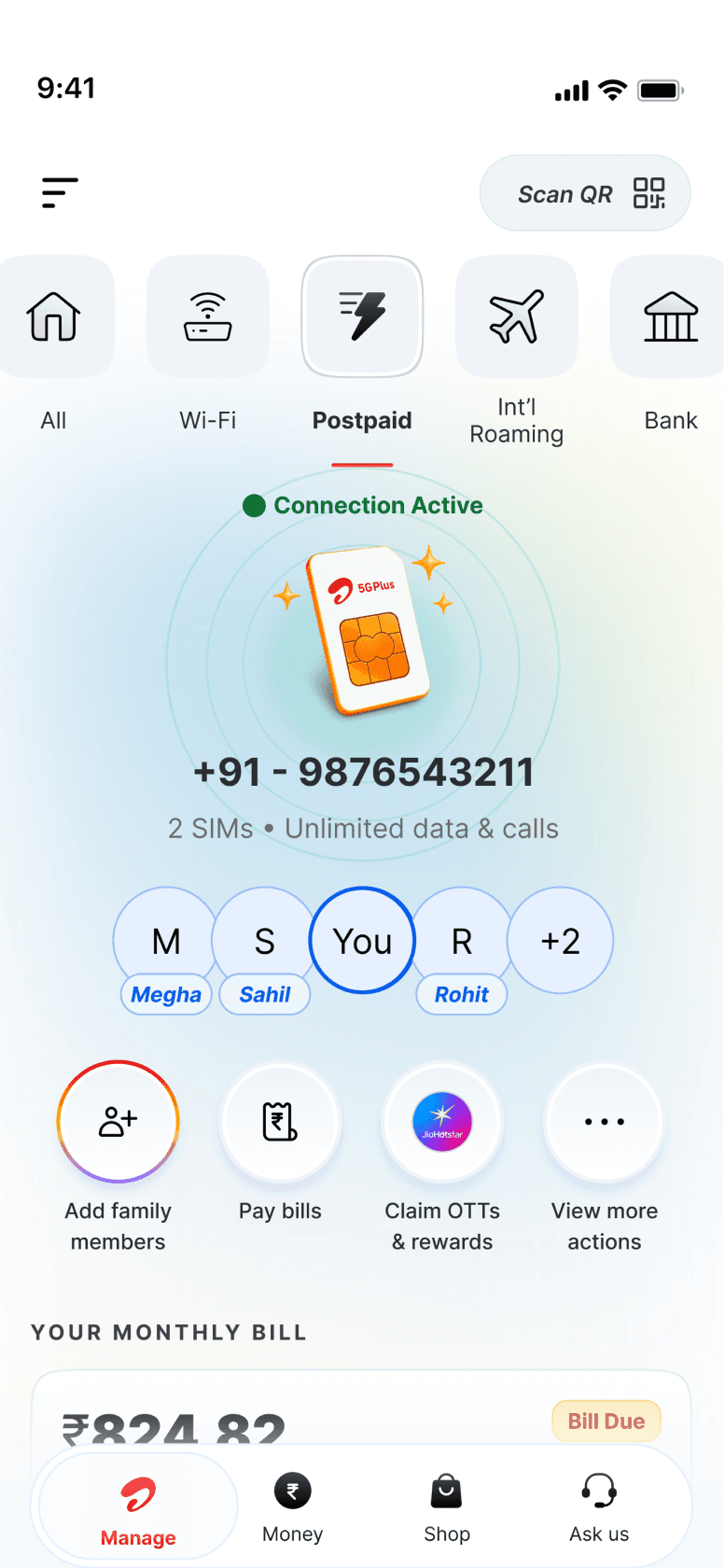
Postpaid · Prepaid · Wi‑Fi
Services, made clear
Redesigning Airtel Thanks' service landing pages to make everyday account management simpler, clearer and more actionable.
Across Prepaid, Postpaid and Wi-Fi, we reimagined how customers access their usage, bills, service information and essential actions - creating a more predictable self-service experience that helps them resolve their needs without relying on customer support.

my role
Lead Product Designer
Timeline
~1 month
team
1 PD, 1 PM, 8+engineers + more
Overview
Business & Challenges
Airtel Thanks helps millions of customers across India manage their Wi-Fi, Mobility (Prepaid & Postpaid), DTH and Black services. Despite serving 15M daily active users, the core “Manage” space wasn’t driving self-serve behaviour.
users go to their service landing pages daily (on avg.)
~8 Mn
48%
of these app-active users still call customer care once a month for information already present on app.
35%
do not visit their service detail page once a month
Service landing pages brought together usage, bills, plan details, benefits and actions, but critical information was often buried. Customers struggled to find the answers they needed, even when the app already had them.
Re-design Service Details to reduce assisted calls and create a predictable, self-serve experience.
Problem statement
Data deep-dive
IVR & Call Centre Data Analysis
This became the foundation of the discovery research
To understand why customers continued seeking assistance, we analysed IVR and call-centre data to identify the most common reasons for contacting support.
~7.2M users
chose assisted channels within 7 days of using the app.
Prepaid
41%
Postpaid
32%
Broadband
20%
DTH
7%
Data usage confusion & Bill clarification
2.6 lakh calls/month
Account health issues (network, validity, DTH errors, outages)
5.8 lakh interactions/month
IVR Language Split
84% - Hindi
12% – Regional Languages
4% – English
Plan change,
clarity & comparisons
3.8 lakh interactions/month
Research & Usability Testing
50+ In-depth Interviews · Behavioural Analysis ·
Journey Mapping

+48
To understand why customers continued relying on support despite using the app, our team conducted 50+ in-depth interviews across multiple lines of business.
We focused on customers who dropped off at key screens and subsequently contacted customer care, combining their feedback with behavioural analysis and journey mapping.
Overwhelmed by information
40%+ of prepaid users studied found the information overwhelming. Dense plan details and unclear actions created hesitation and fear of making mistakes.
Missing clarity at critical moments
All interviewed customers who contacted support reported struggling to find the information they needed at the right moment, particularly around bills and pack details.
Drop-offs before resolution
Journey analysis revealed users leaving key screens before resolving their queries, then turning to customer care for clarification or reassurance.
What This Revealed
The problem wasn't missing information. It was the inability to find, understand and act on it confidently.
Customers came to the app with a clear intent, but poor discoverability, complex language and limited contextual guidance left them uncertain about what to do next.
For many, contacting customer care felt like the easier and more reliable path to resolution.
”
“I want to know what exactly I paid for.”
“Reminder only shows validity — what about due date or low balance?”
“I don’t know if I can see more details of my plan.”
“I get SMS of usage but not real-time updates on the app.”
“I don’t know where my rewards are.”
“What’s included in my pack? I can’t find it.”
“I don’t know what benefits I already have.”
“I need someone to explain my bill.”
“Money is deducted but the app doesn’t show anything — can I trust this?”
“Where can I download my bill PDF?”
“I need a receipt immediately.”
“I want to compare and upgrade my plan but it’s too hidden.”
“How do I recharge for my friend?”
“Where do I buy additional data?”
“I want to upgrade… but I don’t know what’s better for me.”
“Why is my service not working?”
“I can’t see any update on what went wrong.”
“I want to know if there’s an outage before I call someone.”
“I raised a complaint… what next?”
“Talking to a human is easier — I get information faster.”
“I don’t know what feature you offer.”
Plan, Pack & Usage Clarity
Rewards & Offers
Billing, Payments & Receipts
Purchase, Recharge & Upgrades
Account Health & Service Issues
Discovery & Navigation
Understanding the user perspectives
These personas highlighted uncertainty caused by complexity, driving users to customer care.
We developed two behavioural personas to guide our design decisions.
Goals
Manage multiple services independently
Track usage and control costs
Resolve issues without calling support


Behaviours
Remembers plan details and validity
Uses the app to add/remove DTH channels
Calls customer care only for network or mismatch issues
Explores features independently
Pain Points
Important service information is scattered
No single view of account health
Limited visibility into what actions are possible

Needs from the App
Unified service view
Clear service health indicators
Faster access to deep service actions
Predictable, consistent navigation

App usage: Opens app regularly, purposefully
Primary Channel: App first, Customer Care when stuck
Tech Comfort: High
Language Preference: English + regional

The Control Manager
Multi-service (Postpaid + Prepaid + DTH)
“The app doesn’t explain my bill clearly when I need it.”
“Calling feels faster than trying to understand the bill in the app.”

The Assurance Seeker
Prepaid user (manages
2–3 family recharges)
“I watch YouTube to study, so tracking my data is important.”
“I call customer care because the app doesn’t always show real-time usage.”
Issues identified during the evaluation.
Heuristic Evaluation
The audit revealed recurring issues with information hierarchy, visibility and navigation, reinforcing patterns observed during user research.


I evaluated key Manage screens using Nielsen’s heuristics. Major violations included:
The evaluation reinforced a recurring problem: essential information and actions were available, but lacked the hierarchy, visibility and contextual guidance users needed to act confidently.
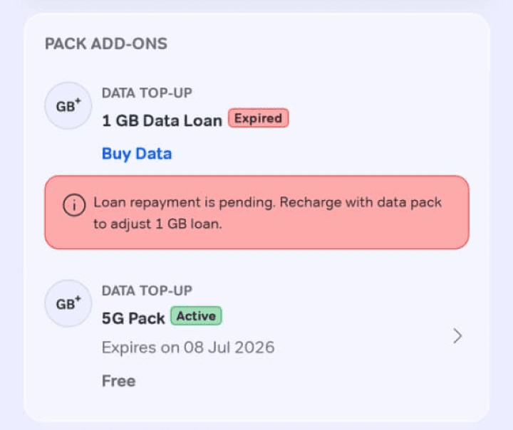
Critical service states lacked emphasis
Expired data packs and other time-sensitive information were not prominent enough to draw immediate attention.
Promotions overshadowed information
Cross-sell banners appeared before essential account details, pushing users' primary needs further down the page.
Quick actions lacked prioritisation
Long lists of equally weighted actions made frequently used tasks harder to discover.
Support lacked context
Help and support options were disconnected from the relevant service information, making resolution paths harder to discover.
Many journeys ended without a clear next step or sufficient context to act confidently.


Bill payments competed for attention
Even when a bill was due, the payment action wasn't sufficiently prioritised over less urgent content.
Non-Primary information is present on the top.
01
Poor visibility of status
Users could not quickly tell if a service was healthy, a pack was expiring or a payment had succeeded.
02
Low user control
Many journeys ended without a useful next-best action or to get more clarity before committing.
03
High recall load
Users had to remember where plan details, bills, receipts, add-ons and service controls lived.
04
Language mismatch
Dense English and technical terms appeared in the exact moments when users were already uncertain.
Synthesising the problem
Turning research into design direction
Design Principles
Research and heuristic evaluation revealed a common pattern: customers had access to the information they needed, but struggled to find it, understand it and act with confidence.
Rather than simply reorganising content, we needed to rethink how service information and actions were prioritised across different customer needs.
Serve clarity before asking for action.
I translated these insights into four guiding design principles:
01
Status before action
Surface service health, usage, validity and dues upfront, giving users the context they need to take the right action.
02
Consistent across services
Establish a familiar information hierarchy across Prepaid, Postpaid and Wi-Fi, while adapting content and actions to each service.
03
Progressive disclosure
Prioritise essential information upfront, with deeper details available when users need them.
04
Clarity at critical moments
Use simple language, clear service states and contextual guidance to reduce uncertainty and help users move forward.
A closer look at billing
Real Pain?

These principles shaped the broader service experience. We then examined high-friction journeys, starting with billing, to understand how they could translate into tangible design improvements.
Billing emerged as a major friction point, accounting for 21% of assisted interactions and becoming the second-largest reason customers contacted support.
This highlighted an opportunity to bring bill status, payment information and relevant actions to the forefront of the Postpaid Service Detail Page—helping customers understand what needs attention without navigating elsewhere.
~1Mn interactions
making it the #2 reason customers
contact support.
on avg, in a week
Postpaid
4,50,000
Black
2,00,000
Broadband
3,00,000

Late Fees
1,00,000
Mid cycle changes
45,000
International Roaming
50,000
Other reasons
8000
Final Architecture
One shared structure. Different service priorities
A shared opening rhythm
Service snapshot → quick actions → essential account information.
Category-specific priorities
Billing for postpaid, data for prepaid, health and controls for Wi‑Fi.
A consistent close
Rewards, contextual recommendations, support and trust markers.
Instead of replicating a single template, we built a flexible architecture that maintains consistency across Prepaid, Postpaid and Wi-Fi while adapting to each service's unique needs.
Postpaid prioritises bills & family controls, Prepaid leads with data usage, while Wi‑Fi makes connection health and device controls immediately accessible.
The hierarchy also adapts to customer states, surfacing time-sensitive information and actions when they matter most.


Postpaid
Prepaid
Wi-Fi
Bills & family management
Usage & recharges
Connection & controls
Newly onboarded users
Prioritise service activation, onboarding information and essential setup.
Recharge Expired users
Highlight expired validity, service impact and a prominent recharge action to help users restore continuity.
Suspended services
Highlight the service issue and immediate next steps.
International Roaming users
Surface roaming-specific information and relevant service controls when abroad.
A newly onboarded customer doesn't need the same information as someone with an overdue bill or an interrupted service.
We defined page variations based on customer lifecycle, service status and contextual needs—allowing time-sensitive information and actions to take priority without breaking the overall experience.
One architecture. Different customer needs.
Design Details
From information-heavy pages to purposeful self-service
Comparison of before and after. Designed around the most frequent and high-intent needs.


new detail page


We grouped actions by frequency, relevance and intent, giving everyday tasks greater prominence while moving specialised controls into dedicated sections.


Old detail page
Snapshot Section
Predictable by design,
Brought connection status, account identity and essential service information together, giving users immediate clarity before taking action.
Claims & value offerings
Bring relevant benefits and eligible rewards into a dedicated, discoverable space.
Promotional Content
Relevant, without interrupting intent
Moved promotional content below essential service information, while introducing clearer, issue-specific support entry points to help users find assistance when needed.
Action Ingress
Introduce relevant service journeys at points where customers are most likely to need them.
Offers
Surface contextual offers without competing with essential service actions.
Support Nudges
Surface issue-specific support options so users can find help without searching across the app.
Priority Actions
Frequently used actions, upfront
Prioritised key actions such as bill payments and family management, while moving less frequent tasks behind a secondary entry point to reduce clutter.
Always a part of experiment by Growth teams, on which actions to prioritise for which cohort
Listed Quick Actions
A long list, covering every single action, from high frequency to no frequency ones.
Bill Card
Make what's due impossible to miss
Elevated the amount due, payment deadline and primary action. Once paid, the experience could deprioritise the bill to make room for more relevant information.
Plan details
Everything about your plan, in one place
Consolidated plan pricing, benefits and relevant actions into a scannable card, reducing the need to navigate elsewhere for basic information.
Control Center
Controls deserve their own space
Grouped service settings such as International Roaming, DND and Hello Tunes into a dedicated section, separating account controls from everyday quick actions.
Using Postpaid as an example, we restructured the Service Detail Page around customers' most frequent and high-intent needs. Instead of giving every piece of information and every action equal prominence, we established a clearer hierarchy—starting with service status and priority actions, followed by plan details, controls and contextual support.
Top fold - Service Snapshot → Priority Actions → Bill Card
The customer can quickly understand their service, identify what needs attention and act.
Further down the page - Plan Details → Controls → Benefits → Support
Customers can progressively explore deeper account information, secondary tasks and support.


Being a self-serve page, serve took a precedent always, but as a business, we wanted to have sell inventories prioritised when there is no critical action at user end.

Design decisions
Designing for context, not just consistency.
While the Prepaid team prioritised self-service and service continuity, the same placement supported the Postpaid team's acquisition goals through upgrade leads.
Serve First. Sell When Relevant.
Service Detail Pages are designed to help customers manage their active services, but they also create valuable opportunities for upgrades and cross-selling across Airtel's businesses. Rather than removing promotional opportunities, we made their visibility dependent on customer needs and service states.
01
Critical service needs come first.
Bills due, expiring recharges and service issues take priority over promotional messaging.
02
Sell when no critical action is pending.
When no critical action is pending, surface relevant upgrades, bundles and cross-sell opportunities.
03
Encourage better use of existing services.
Remind customers about unused benefits or actions, such as adding available family connections to their Postpaid plan.
Old detail page
Serve remains the primary purpose of the page, while Sell becomes a contextual opportunity—not a competing priority.


new detail pages
Critical State
Serve takes priority
Sell gets an opportunity
Non-critical state
The challenge was to preserve commercial opportunities without letting them compete with customers' immediate service needs.


Upgrade to Postpaid
Explore more data and plan benefits.
Recharge expired
Restore your service with a recharge.
Promotional overshadowed information
Cross-sell banners appeared before essential account details, pushing users' primary needs further down the page.
Contextual prioritisation
The page adapts to service status—surfacing urgent actions first and enabling relevant commercial nudges when no critical action is pending.
Larger Promotional Content
These were moved further down the page, preserving the visibility of essential service information.

One Bill Card. Different customer needs.
A bill isn't just an amount to pay. Its information, urgency and available actions change throughout the billing lifecycle. We explored how a single Bill Card could adapt to different customer states while maintaining a familiar, predictable experience.
Make current state unmistakable
From upcoming bills to overdue payments, surface the most relevant status and information upfront, with deeper details available when needed.
Explain what isn't obvious
Use contextual messaging to clarify first bills, unusual charges, validity adjustments, payment due, or changes without overwhelming the default experience.
Make every action contextual
Prioritise paying when a bill is due, viewing or downloading when it's paid, and relevant next steps when intervention is needed.
How a component adapts across billing states, information needs and actions.
Changes & Impact
From clearer information to measurable self-service outcomes.
How we measured success?
It was evaluated on whether customers act on time, find answers without assisted support and return back because the page is useful not because they are stuck.
01 / Primary
Self-serve & continuity
Did we make everyday service management easier?
1
Higher self-service completion
More customers resolving their needs without moving to assisted channels.
2
Lower digital-to-assisted (D2A) transitions
Fewer customers turning to calls or chat support for service information already available in the app.
3
More on-time continuity actions
More bill payments and recharges completed before or on their due dates.
02 / Secondary
Growth & engagement
Could we improve usability without compromising business opportunities?
1
Plan & Pack Upgrades
Plan upgrades and higher-value prepaid recharges with continuity and on time payments.
2
Feature & Benefit Adoption
Postpaid family additions, International Roaming activations and OTT benefits claimed.
3
Relevant Discovery & Conversion
Cross-sell conversions and engagement with relevant service recommendations.


Old
New
Updated


We improved the visibility of billing information and relevant actions on the Service Detail Page, helping customers identify what needed attention before entering the billing journey.
Introduced contextual reminders for time-sensitive service actions, making critical information easier to understand and act on
Users landed on unfocused bill lists, so in parallel with reminders, we redesigned bill detail pages to bring clarity and focus.
↓ Customer Care Dependency
11%
Reduction in bill clarification related calls
27%
Reduction in account health & service status queries
+12% uplift in CTR
↑ Self-Serve Success
+18%
increase in users completing tasks without escalation
By prioritising essential service information, simplifying key actions and introducing contextual guidance, we made it easier for customers to manage their services independently.
The goal wasn't to make customers spend more time on service pages. It was to help them find what they needed, act with confidence and move on—without unnecessary support.
Part of a different project
Scale & Complexity
Designing beyond the happy path
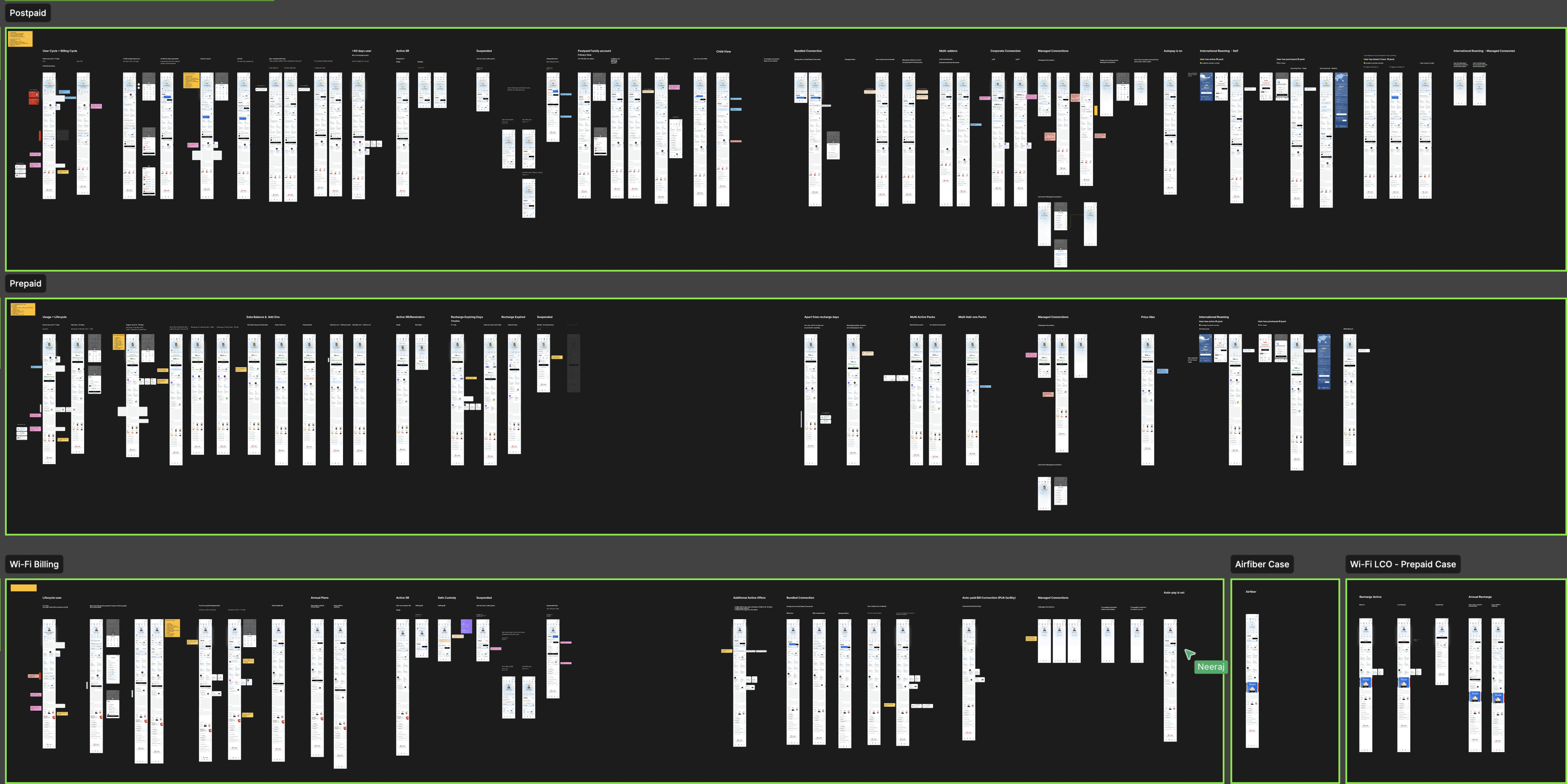
The challenge wasn't just redesigning three service pages. Each service had multiple customer states, lifecycle stages and edge cases, all requiring different information and actions. We mapped these scenarios and designed variations within a shared architecture, ensuring the experience remained familiar while adapting to customers' changing needs.
One shared foundation - Maintained a consistent information hierarchy across Prepaid, Postpaid and Wi-Fi, while allowing service-specific content and modules.
Context-driven prioritisation - Adapted information and actions for different states, from newly onboarded users and first-time bills to overdue payments and service suspension.
Handling edge cases - Considered scenarios such as plan migrations, suspended connections and International Roaming activation to ensure critical information and next steps remained accessible.
When an action becomes time-critical, the relevant module takes precedence over secondary information, while the rest of the page retains its familiar structure.
Reflections
What designing self-service at scale taught me.
01
More information doesn't mean more clarity.
The challenge wasn't adding new features, but identifying what mattered most at each moment. I learned that thoughtful prioritisation can be more valuable than providing every possible piece of information upfront.
02
Consistency shouldn't come at the cost of relevance.
A shared architecture helped us create familiarity across services, but each customer had different priorities. Designing for scale meant defining what should remain consistent and where the experience needed to adapt.
03
Good design balances customer needs with business goals.
Prioritising service actions meant rethinking the prominence of promotional content. The challenge was to make everyday tasks easier without losing opportunities for discovery, engagement and growth.
I'd place even greater emphasis on measuring successful task resolution across different customer states, alongside support volumes. Understanding not just whether customers used the page, but whether it helped them resolve their needs, is what ultimately matters.
This case study reflects how I think, not just what I design.
Go Top

© 2026


Reminder to you & me : Let’s go touch some grass.
built with love, brain and AI in the slowly burning world…
Explore more work
Next project ↗